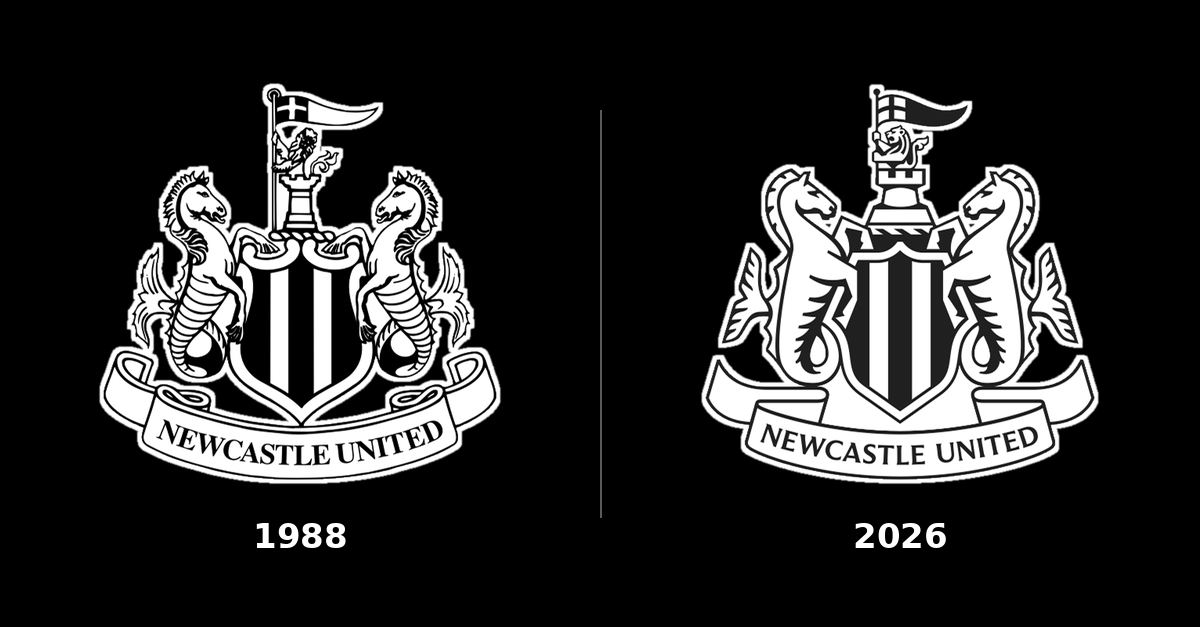
Newcastle United unveiled its new crest this morning, the first change since 1988. Look twice and you might still miss it. That's the point.
The club spent more than two years asking supporters what they wanted, through events, focus groups, workshops and surveys. It says 84% of survey respondents wanted the existing crest updated rather than redesigned from scratch. The problem was practical: the 38-year-old design blurred on phone screens, in broadcast graphics and in stitching.
So the design team, led by chief creative officer Kenneth McIver, kept the castle, the black and white shield, the seahorses, the lion and the pennant, and redrew them with even line weights that hold up at any size. Creative Review calls it "very much an evolution". Three options went to an independently run poll of season ticket holders and members. The club says 27,348 took part and Option C won 64.8% of first-choice votes. It reaches the kit in 2027/28.
Why it matters: this is how you change a heritage brand without a riot. Chief executive David Hopkinson says fans told the club to "protect what we have" and "do not start again", and every decision stayed inside those limits. Compare Leeds United in 2018. Its "Leeds salute" crest followed consultation with 10,000 people, yet more than 77,000 signed a petition against it and the club dropped it. Asking fans for input isn't the same as letting them set the rules. Newcastle let fans set the rules, then gave them the final vote. Not every brand has 27,000 people who care this much. If yours does, hand them the pen before you show them the finished design.
Sources: Newcastle United, BBC Sport, Creative Review, BBC Sport on Leeds United and Dezeen.
Image: © Newcastle United Football Club